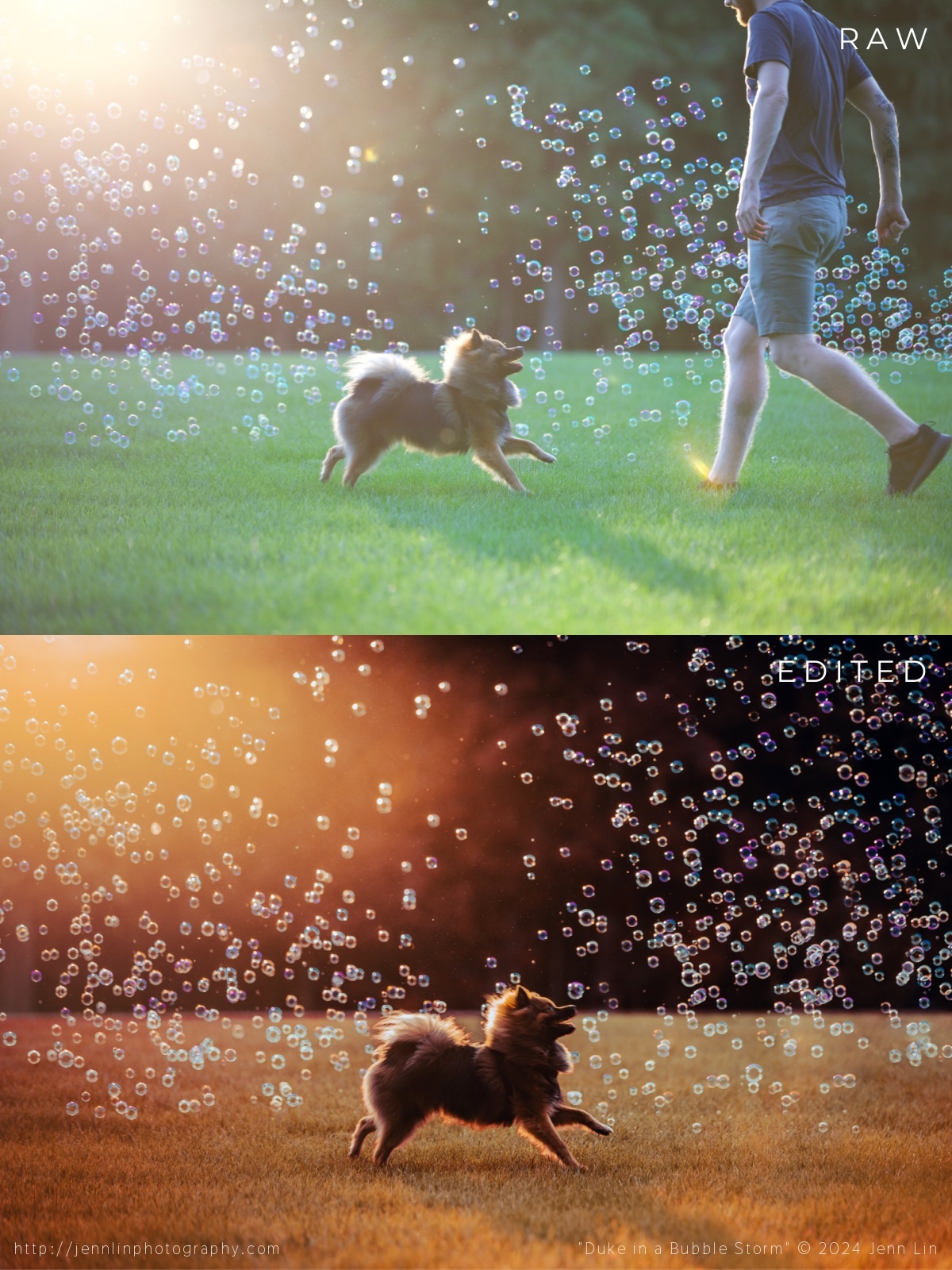
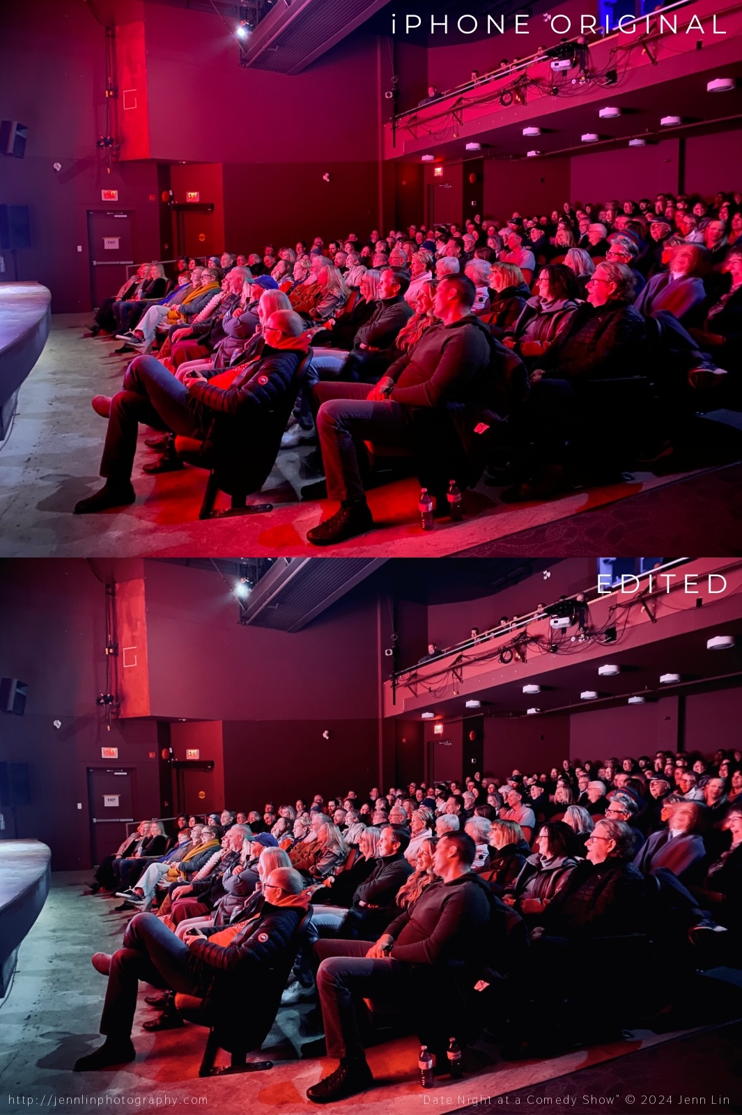
The most tedious part of editing this image was probably recovering the overexposed highlight in the middle. There is no easy shortcut here—just lots of trial and error: cloning patches at different opacities and healing to bring back texture/detail, until it looked passable. Had I not shot this at the settings I did, however, I probably would have lost too much detail in the shadow areas (black spots on her face, near her eyes). Then there are all the branches I decided to remove… the water I wanted to sharpen up and add contrast to… the owner’s runners I took out of the photo (standing on the rock)… the decisions made about how much blue to add to the greens… how saturated should the oranges be so that it popped? How warm do I want it to look? There are countless problems solved in every image that add up to the final end result. And that is why I love the post-production stage equally if not more than the actual shooting stage. Capturing a magic moment is just the beginning… Retouching is where the image really comes to life!Here I was aiming for a green-tinted Annie Leibovitz-style self-portrait. Blemish removal and colour grading applied in Lightroom. Further edits could have been made in Photoshop: liquify tool to bring in the gaping of my dress, or frequency separation to further tone down the hot-spot in my t-zone.Perhaps one of my most iconic images of Duke… all the bubbles were real! Thankful I had an assistant on hand to help pose Duke’s face. Nothing complicated here: removed my assistant and cloned back enough bubbles, some in batches, some one-by-one, to cover the hole. Then I shifted the greens to be more burnt orange (I love a hot summer afternoon look). Adjusted the levels so that the blacks were super black. Cropped the image so that Duke was more in the centre. Lightened the shadows on the grass to remove visual distractions.This image was captured on stage at a Yuk Yuk’s comedy show I was asked to photograph. I decided to use my iPhone rather than the wide-angle lens and DSLR I had on me particularly because I knew it would overexaggerate the look of the lights (iPhone lenses are known for lens flaring). The edits here were pretty simple: I removed the light from the doors and one of the “exit” signs to balance the image, leaving only one on each side. Added some blue to counterbalance the yellow and cool down the image. Made the blacks blacker for punch. Lens correction to make the curtains appear straighter and less curvy.I loved the original image for its composition, but not the colours. So I found a filter in Lightroom and then made some selective colour adjustments to remove most of the red cast from the audience members’ faces. The image was then used for this social media post advertising two upcoming shows in the series (here).